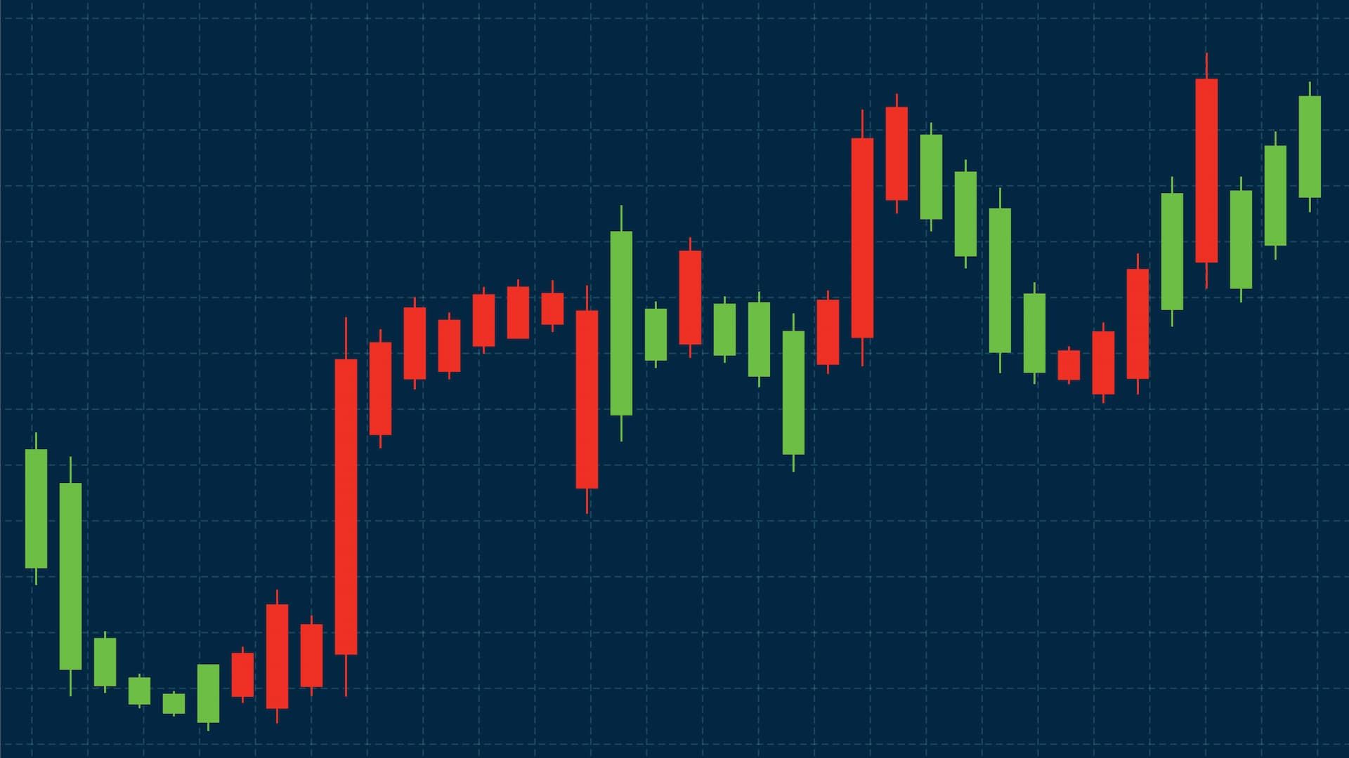
Candlestick charts are probably one of the clearest ways to get a sense of how price movement works. They show you exactly what happened to the price over a specific period of time, and help beginners quickly figure out who came out on top between buyers and sellers. Compared to simple line charts, this type of financial chart gives a whole lot more context and is way easier to read once you know the basics.
What Is a Candlestick & How Do You Read It?
A candlestick shows you the price movement for a particular time frame, anything from one minute to one day, and so on. Each candle answers four pretty simple questions:
Where did the price open? Where did it close? How high did it go? How low did it drop?
In a nutshell, a candlestick is a little story about the battle between buyers and sellers during that period. If the price closed higher than it opened, buyers were the winners. If it closed lower, sellers came out on top.
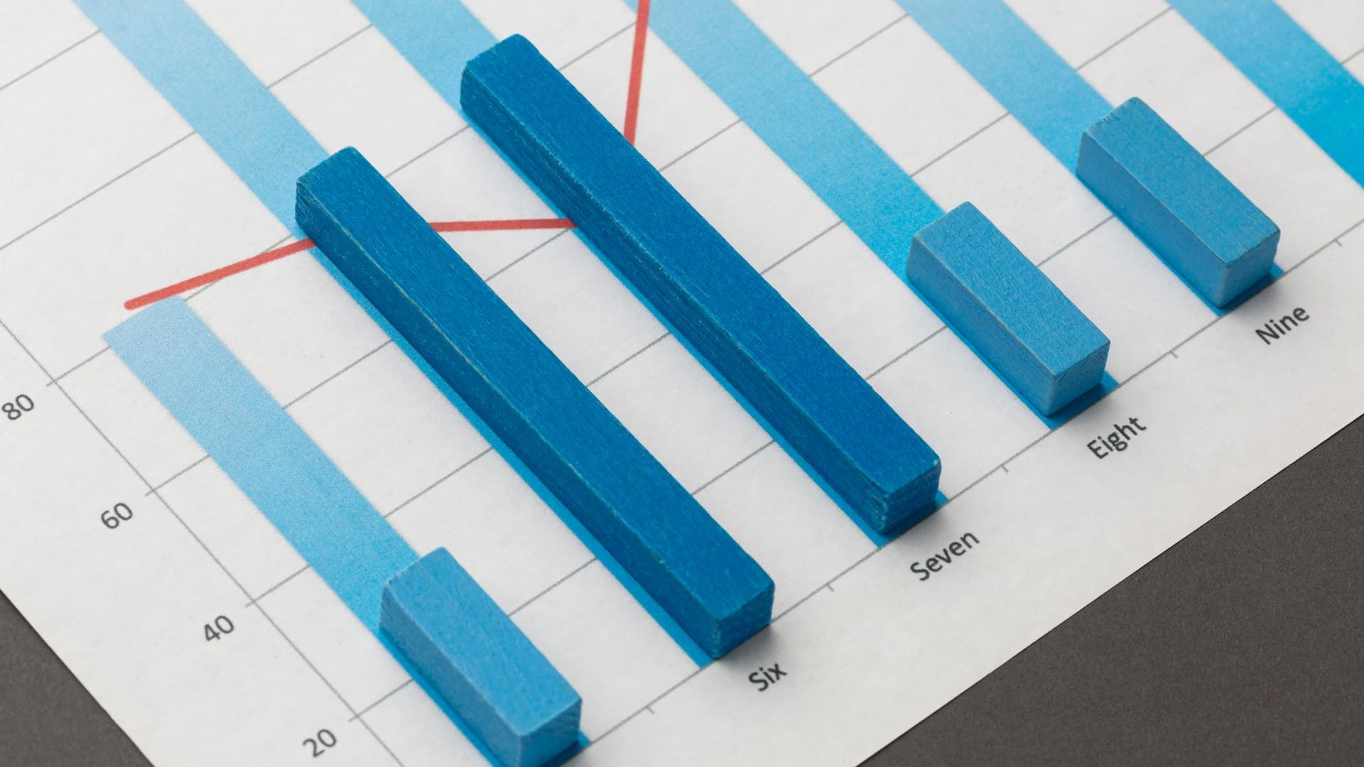
This makes candlesticks way more informative than bar charts, which show similar data, but are a lot harder for beginners to get a handle on quickly.
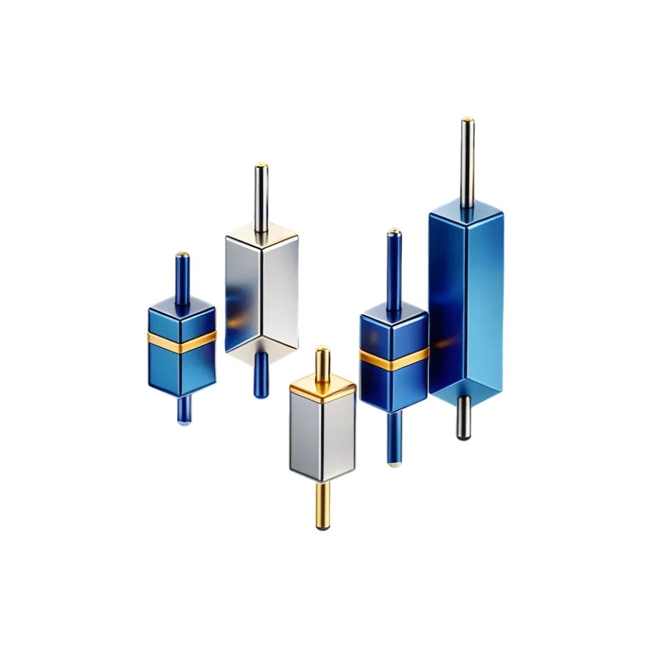
Anatomy of a Candle Stick
A candlestick has three main parts:
-
Body: that's the distance between the opening and closing price
-
Upper shadow: how high the price went before falling back down
-
Lower shadow: how low the price dropped before recovering
Take a candle with a small body and a long upper shadow. That means the price went up, but sellers came back and pushed it back down before the period ended. Often that shows hesitation or weakening momentum.
When candles form during high market volatility, shadows usually get a lot longer, showing fast and emotional price movement.
Why Traders Prefer a Candlestick Chart Over Other Visuals
Candlestick charts make patterns a lot easier to spot. Instead of trying to guess direction, traders can visually see pressure building up. For example, several green candles with big bodies usually signal strong buying pressure, while a bunch of red candles might point to a downward trend.
This visual clarity is why candlesticks are preferred over simple lines or bars when analyzing price behavior.
Understanding the Basics of a Candle Chart
A candle chart helps you get a handle on price behavior without needing to do any complex math. Each candlestick shows how price moved during a specific time period and gives you clear clues about market sentiment. Even a single candle can provide valuable insights if you know what to look for.
How Price Movements Are Displayed in a Candlestick Chart
Each candlestick is built from four prices: open, high, low, and close values. Together, they form the key part of how price action is visualized.
-
The body shows the distance between the opening and closing price
-
The shadows show how far price moved during the period
For example, if the first candle opens low and then closes way higher, that signals strong upward movement. If the second candle fails to move higher and closes near the open, momentum might be slowing.
When several candles appear near the same price zone, they often highlight resistance levels, where price struggles to move higher.
Interpreting Market Sentiment Through Candlestick Colors
Colors make interpretation a lot more intuitive. A green candle usually means price closed higher than it opened, showing buying pressure. A red candle shows sellers were stronger during that session.
Some formations give a deeper insight:
-
Spinning top candles have tiny bodies and long shadows. They signal indecision.
-
A shooting star forms near the top of a move and often warns of selling pressure.
-
A hanging man looks similar but appears after an uptrend, suggesting weakness.
-
A hammer shows strong rejection of lower prices and possible buyer control.
These patterns become more reliable when they appear after a clear trend and are confirmed by the second candle.
Key Candle Patterns Every Beginner Should Know
Candlestick patterns help beginners understand who's in control of the market at a given moment. Each pattern is built from price behavior on the chart and reflects the balance between buyers and sellers during a specific period. The goal isn't to memorize names, but to read intent from how candles form.
Reversal Candle Patterns
A reversal pattern appears when an existing trend starts to lose strength and price may change direction. These setups are especially important after a long uptrend or downtrend.
For example, after a steady rise, a candle with a small body and long shadows often shows hesitation. That means buyers are no longer fully in control, and sellers are pushing back. In a falling market, the opposite logic applies.
A common example is the doji. The open and close prices are almost the same, which tells us neither side won that session. After a strong move, this indecision can signal a possible turn. Another classic reversal scenario is three white soldiers. It appears after a pullback and shows three strong bullish days in a row, each one closing higher than the last, a pretty clear sign that buyers are stepping in.
Bullish and Bearish Signals Explained
Bullish signals suggest the price might start heading up. They tend to pop up after a decline and indicate buyers are starting to get some strength. A candle with a long lower wick and a strong close is a pretty basic example of a bullish sign.
Bearish signals on the other hand suggest the price might take a tumble. These often appear right at market tops. Long upper shadows or failed attempts to push higher show sellers taking control of the market.
The same pattern can play out in different ways depending on the context. Where it shows up on the chart, how strong the previous move was, and what's happened in the price action recently.
Continuation Candle Patterns
Continuation patterns signal that the current trend is going to keep on going after a brief pause. They usually form when the market takes a breather before moving further in the same direction.
These patterns often feature tiny real bodies, which means price is just consolidating rather than actually reversing. This pause lets buyers or sellers regroup before the next move.
For instance, when you see a series of small candles moving sideways in an uptrend in a particular stock, that's not weakness, it's just balance. When price breaks out of that range and keeps moving, the trend often picks right back up.
Patterns That Confirm Existing Trends
Continuation patterns confirm that the dominant side is still in control. If you've got an uptrend going, buyers are still defending higher prices. If you've got a downtrend, sellers are still preventing price from rising.
These setups work best when the trend is super clear and the consolidation period is nice and short. On a candlestick chart, this looks like a bunch of tight candles followed by a strong move in the original direction.
For traders just starting out, the key takeaway is simple: reversal patterns warn you of change, continuation patterns confirm the direction. Once you learn to spot both of those, reading the chart becomes a lot more structured and logical rather than confusing.
Identifying Trends Using a Candle Stick Formation
A candle stick formation helps you spot the market trend without needing any fancy indicators or tools. The idea is pretty simple: just look at how the candles behave over time, not at any one candle in isolation.
In an uptrend, most candles close higher than they open. You'll see bigger bodies, shorter lower shadows, and price consistently making higher highs and higher lows. This shows buyers are in control and happy to buy at ever-increasing prices.
In a downtrend, the opposite happens. Candles frequently close lower, upper shadows become more visible, and price makes lower highs and lower lows. This tells you sellers are dominating and pushing price down every time it tries to rise.
Sideways trends are also easy to spot with candlesticks. Bodies become smaller, shadows show up on both sides, and price just sort of moves in a tight range. This usually means the market is unsure about what to do next and is waiting for a new impulse.
The key rule is all about context. One candle doesn't define a trend. It's the sequence of candles that does. When you read candle stick formations as a story unfolding over time, trends become really clear and a lot easier to follow, even for beginners.